In many homes women still do much of the home furnishing and nest feathering. But I find it troubling to see an overly feminine main bedroom that is intended to be shared by a couple. Whenever I’m designing a bedroom for a man and a woman, if at first glance I can’t see a man being comfortable there, then I get back to work. This generalization may offend the utmost of feminist views but a slight shift in hue or colour intensity is often all that is needed to please both.
This post on Bedroom Design Ideas to Please Him and Her was originally featured on Houzz.
Choosing a Color
Color seems to be the common theme in overly feminized rooms, more than individual motifs or other elements. Lace, for example, decidedly feminine, probably appeals more to a man when it’s black, right? The use of soft pastels and pinks, but also the absence of dark colors in general, can leave a bedroom feeling too girly.
One rule of thumb in design is that every room needs a touch of black to anchor it. Here’s another color insight: Orange and blue make for the most appealing complementary color combination in advertising to reach a male audience. Picture the New York Mets uniforms.
Indeed, color is key, but how much do you need? Often subtle shifts are enough.
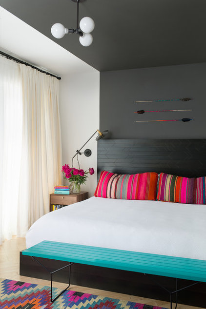
This smoky backdrop dramatically defines the sleeping zone while setting other colors ablaze with vibrancy. Hand-crafted Native American inspired flat-weave rugs with colors that pop meet a clean-lined discipline. Arrows step in as objets d’art above the bed.
Vive la différence. If she likes a streamlined style but he wants to display something rustic or tribal, like a collection of arrows, celebrate them in a minimal display with graphic interest. Keep the colours contemporary, the displays minimal. Put it all together and everybody wins.
Masculine Meets Traditional
Her style, his colors
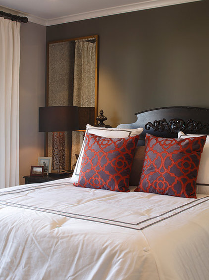
If you love traditional but your partner feels left out, take notes. The success here starts with the deep smoky wall color. This alone keeps the room from being too feminine. If you enjoy traditional motifs and patterns, pick a simplified version for accents in a bolder color combination, as with these toss pillows. They repeat the smoky wall color in the background and add a hit of rich color to tie together a layered look. Use soft white bedding, as done here, but keep it crisp and tailored.
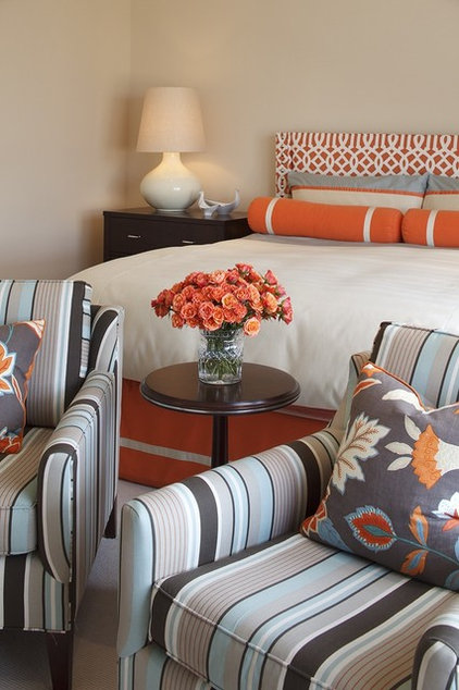
Color for Two
Orange and Blue
This classic scheme draws on complementary colors that appeal to masculine tastes but are offered in a female-pleasing interpretation.
Keep both parties happy. A subtle shift from orange and blue to coral and aqua may be more pleasing to women. Choose an artful mix of bold patterns and anchor it with charcoal to get this look right for both of you.
Minimal Color
Punchy Color
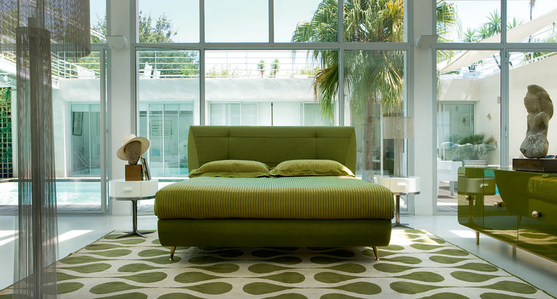
Maximize blue and green
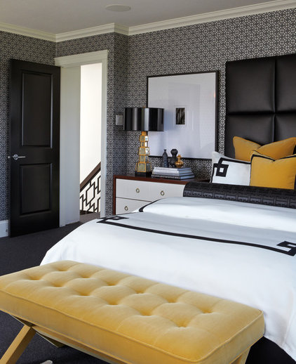
Hello, Yellow
This universally gender-neutral color steps in to rescue the most style-challenged couples.
Tip: Set yellow against black to balance it. Use tufting, like on this bench, for softness, and black trim on bedding to add an edge. It’s nice how this dark trim echoes the railing detail on the stairs.
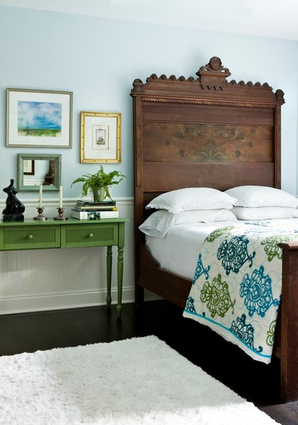
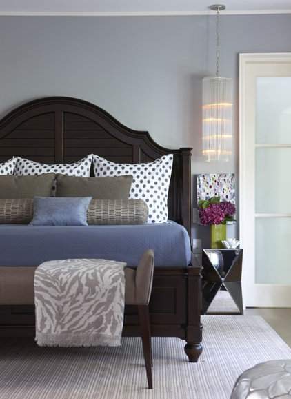
Keen for Green
Incorporating Black
Tip: Outline light colors with black. Take a cue from Johannes Itten (one of the main pedagogical forces behind Bauhaus and a contributor of a unique theory on color). “Light colors on light backgrounds can be greatly strengthened if outlined in black,” he said.
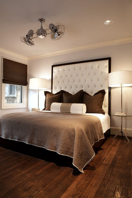
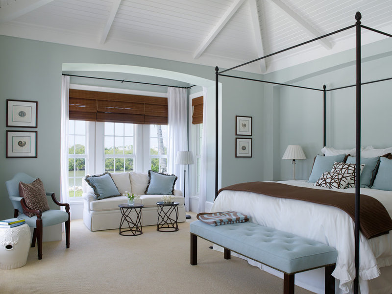
Blue Is the Hue
Tip: Use white backdrops for dark colors. “Dark colors appear most striking against white,” Itten said. This room lands right in the Goldilocks zone: not too manly, not too girly — just right.
If you need some help, you can always reach out for a consultation!