
While choosing a new paint color can bring the biggest transformation for your home for the smallest investment, picking the right color or hue can seem like a daunting task when you are facing three thousand five hundred paint colors. It is especially disheartening if you’ve paid a painter or spent hours rolling paint onto the wall yourself, only to realize it’s just not right at all.
On one hand, it’s just paint, and it can easily be painted over. But when time and money are lost, it can be very frustrating indeed. I know, I’ve done it (read here about my disastrous mistake)!
There are tried and true tips the pros use that will ensure a good outcome. Nothing beats a trained eye, and I have invested many hours in education to understand how to read the undertones of the most nuanced colors, but there are steps you too can follow to guide yourself to a better selections.
So, how do you choose a paint color like a pro?
7 Tips for How to Choose Paint Colors for a No-Fail Result
1. Choose the Paint Color Last!
This is probably the most important cardinal rule designers all follow. It seems counterintuitive to many people but it is far easier to choose a hue from the thousands of paint colors to go with your furniture, and fixed elements than it is to find decor to go with a paint color. Your paint color should relate to all of the other furniture and furnishings in your home including fixed elements like countertop, cabinets etc.
2. Start with an Inspiration Piece or Image
In design, when picking a paint color, I work with the largest or most prominent features in your home. That may mean an area rug, or a large sectional, a countertop, or a piece of artwork. When you start with an inspiration piece you can select colors to unite the things that are already in your home.
One of the best ways to develop a color palette is to choose from a pattern in multi-colored upholstery fabric, a bedspread, a piece of art, or even a piece of fabric that you love.
3. Choose a Pleasing Neutrals for Walls
If you love color, you may want to use bold, beautiful color on your walls. But, for most of us, it’s best to keep the walls neutral and use those bold colors for accents and accessories. Don’t rule out the option of painting a feature wall if you really crave a strong color, but keep the the walls neutral. Having said that, blues and greens are colors found in nature so they can be considered neutral in the right intensity and context.
There are a few advantages of using neutral colors for your walls:
The walls are not typically a feature of your room, the things in it are. Choosing a neutral for your walls leaves the attention to be cast on the things you have invested in like furniture and your furnishings rather than on the walls. The only role your walls have (apart from holding up the ceiling) should be as supporting cast for your furniture, and art. They are not the main feature.
When you keep your walls (and major pieces of furniture) neutral, you can easily change the accent pieces bringing a fresh look with the seasons, or when a whim catches you.
Neutral walls make decorating for holidays easier to add festive and seasonal touches.
4. Look For the Undertones
If you have ever chosen a paint color that was less lovely than you envisioned, it may be because paint colors are made from complex color formulas giving them an undertone that is either warm or cool. An undertone is a cast or a color can have that is not the primary color. For example, some greys may have a bit of a green, blue, or violet cast. That cast, or undertone is not the first thing you see, but it becomes evident when you compare to other similar colors. They will read grey first, and upon further analysis you see that not all greys look alike. In fact grey paint is not just a mix of black and white, or there would only be one! You can read a lot more about undertones here.
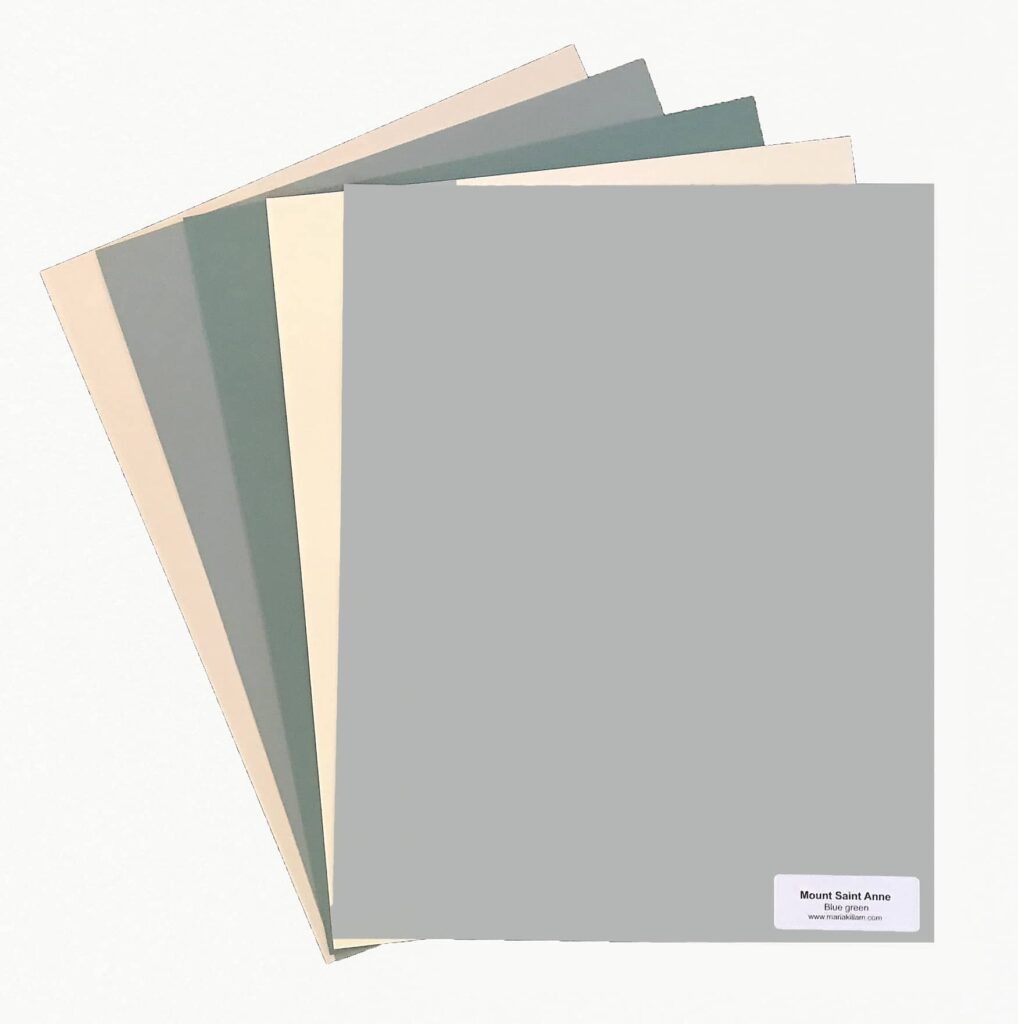
5. Test With the Largest Sample Possible
You were never meant to pick a paint color from a paint strip from the store. Please read that again! The small sample strips are to help you narrow down from many to a few to proceed to the next step with.
After you’ve narrowed down some options to a few potential paint colors, pick up the largest paint swatches that your store has and bring them home. If they don’ have large format samples, I recommend getting a small sample of the colors mixed to paint your own large-format paint chips. I use 11” x 14” heavy weight watercolor paper but you can used Bristol board or poster board. (I have 300 of the most popular paint colors in full-format size which I bring to any paint consultation.)
Look at the large samples in different parts of your room to see it in different light. Consider the next to your larger fixed elements (countertop, floors, cabinets furniture etc.) to determine which hue harmonizes best.
6. Test At Home, With Accurate Lighting
Lighting will affect how your paint colors look in your home, and may even make the same color look different in one room than the next. This is why you cannot pick a paint color under the lighting at a paint store. You don’t have that lighting in your home. With the larger swatches we recommend, it will be to determine which paint color looks best in your space.
It is both helpful and confusing to know a bit about the lighting nature adds to the complexity of picking paint.
A bit of theory – feel free to skip over or not!
- South-facing rooms have the warmest light because the sun comes in all day washing the room with warm light. This can pull any warmth out in a paint color revealing any yellow cast, and can wash out colors, making them look more pale than in another exposure. Cooler colors may be preferred in a room with southern exposure, to balance the yellower lighting.
- North-facing rooms will have cool natural light (blue or grey). In north-facing spaces, a cool color will seem even cooler and more blue-grey and chilly than it would in another room. A warm paint or a neutral with a warmer undertone color may be preferable here.
- East-facing rooms receive their best natural light in the morning, which can make them feel cheerful and bright at that time of day, but they don’t get bathed in the super warm glow a south facing room will get. As the day progresses, the light shifts to the cooler and bluish end of the spectrum. Warm colors or light colors with warm undertones such as yellow, pink or beige will balance the natural light. These colors will feel cozy and inviting.
- West-facing rooms receive their most natural light in the afternoon, making them feel warm and cozy at that time of day. Yet, the light can be intense. In the morning hours, the room can have a gray cast and feel cold. To balance the natural light, consider use whites with a slightly warm undertone, blues with a hint of green or grays with warm undertones.
6. Select the Paint Sheen for Your Use
The sheen will affect how your paint color will appear, and also how scrubbable it will be. In general, higher sheen will be easier to keep clean. Th downside is that the higher the sheen, the more imperfections it will show. For this reason, if your walls are not in great shape, use a lower sheen to hide any flaws.
Gloss (shiny) is highly wipeable and easy to clean, but is generally too shiny for walls unless you are going for a high-end lacquered look. Gloss is good for baseboards, trim, and cabinets but we tend to step the sheen down a bit for a softer look.
Semi-gloss (less shiny) is also quite wipeable, with less shine. It is great for trim, cabinets, and high-moisture areas, like bathrooms.
Satin (Has a bit of subtle sheen) works well for walls in high-traffic areas like hallways and kids’ rooms. Satin finish paint is also a good choice for bathrooms because it’s wipeable.
Eggshell, (barely perceptible increase in sheen from Matte) a little more durable than flat or matte paint, is okay for spaces that see some traffic like living rooms or dining rooms.
Flat or matte (no sheen at all) is a good option in rooms like master bedrooms where the walls won’t really be touched much.
7. Create Flow With a Whole Home Paint Color Palette
There is no rule that says you have to paint your entire home one color, but we aim to have cohesive flow between adjacent spaces. A whole-home color palette will relate as you move from one space to another giving an overall cohesive experience. You can achieve this by choosing colors that relate to one another but use them in varying proportions in each room.
Repeat colors, using different placement, and proportions.
The Number One Thing You Should Never Do When Choosing Paint Colors
You read it above, but it bears repeating. Never pick a paint colour from a tiny bar on a paint strip in a store. Design professionals may be able to with extensive training but most do not.
So often people go to the paint store/hardware store to buy paint for a weekend DIY room makeover. With a general idea of what color they want (blue, green, red, yellow), they’re on a mission to pick a color to transform their room. They choose a color based on a small chip, under fluorescent lights and purchase a gallon or two. They’re so excited to get that paint up on the walls.
But when they get home and start painting, the paint doesn’t quite look like it did at the store. It is not nearly as lovely as they envisioned.
Back to the number one thing you should never do: Do NOT choose paint colors from a tiny paint chip at the store!
Why?
Paint formulas use multiple pigments to create the nuanced colours available for purchase giving them, which look different under different lighting conditions.
It simply will not look the same in large quantities at home. Those lovely long paint swatches you get at the hardware store are great for helping you narrow down from many to a few to sample.
Follow these steps to get the color right. If you get stuck, or feel intimidated, book a paint color consultation.


